To design an immersive landing page for Nike Sky, a limited-edition sneaker collection inspired by clouds — lightweight, comfortable, and visually minimal.
The goal was to translate the product’s core idea into a digital experience that feels as light and effortless as the shoes themselves.
1. Concept development & visual direction
2. Landing page design for a limited collection
3. Scroll-based storytelling experience
4. Product reveal animation (cloud interaction)
5. UI/UX design with focus on minimalism
6. Conversion-focused call-to-action placement
1. Research: I explored visual themes around lightness, air, and softness, as well as how premium sneaker brands present limited collections.
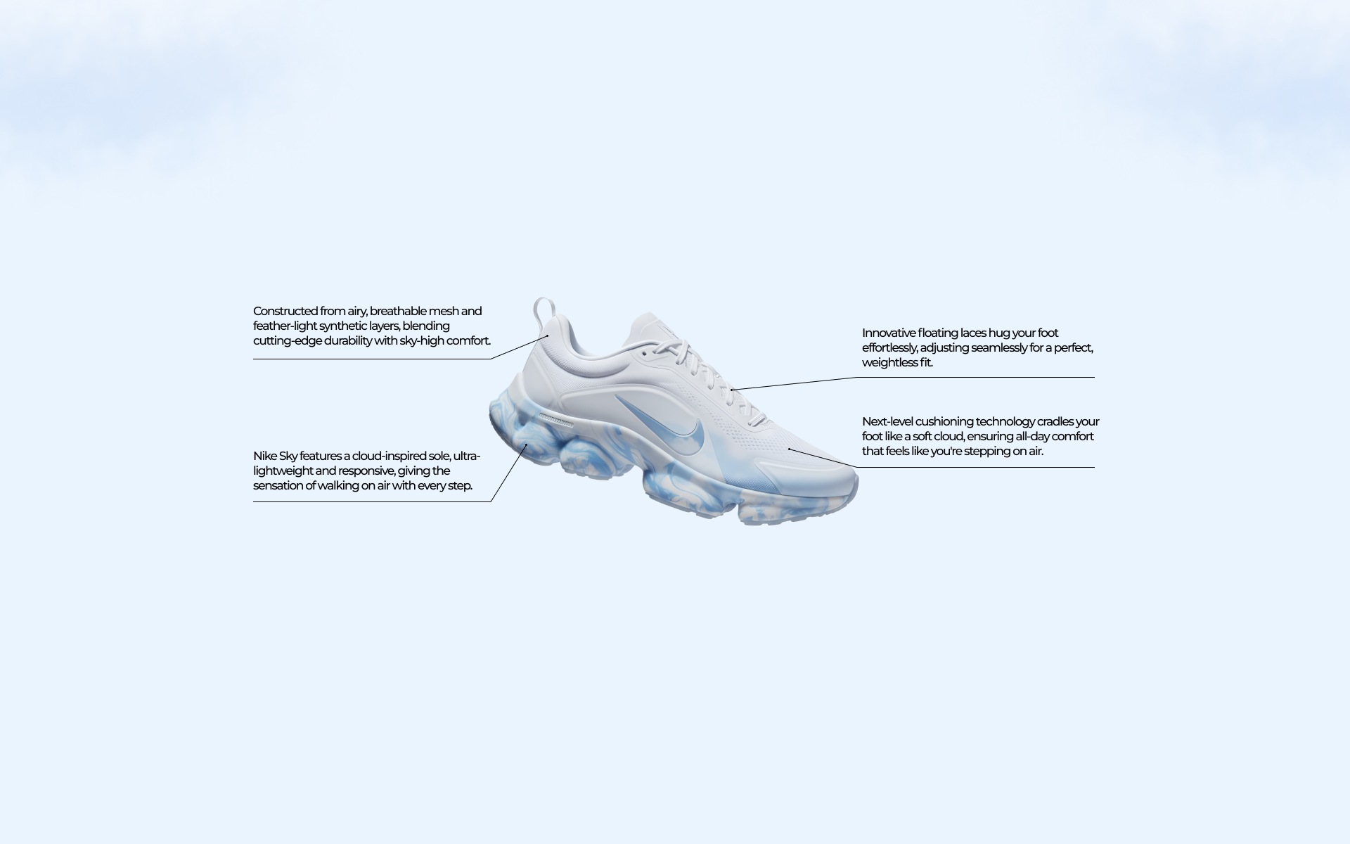
2. Concept Development: The main idea was to place the sneaker within clouds, creating a strong visual metaphor for comfort and weightlessness.
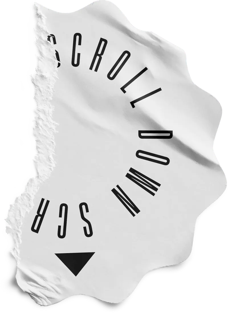
3. Interaction Design: I designed a scroll-based experience where the shoe gently descends through clouds, gradually revealing product details in a natural and engaging way.
4. Visual Design: A clean palette of white and soft blue tones was used to create an airy, calm atmosphere that supports the concept.
5. Refinement: I adjusted animation timing, spacing, and transitions to ensure a smooth and premium feel throughout the experience.
6. Finalization: A clear and minimal call-to-action was placed at the end of the journey, guiding users toward purchase without disrupting the flow.
The final design delivers a unique and memorable product presentation that stands out from traditional e-commerce layouts. The scroll interaction increases user engagement, while the visual storytelling effectively communicates the key benefits of the product.
The Nike Sky project demonstrates how strong visual concepts and motion design can elevate a product launch. By combining minimal UI with atmospheric storytelling, the experience creates an emotional connection with the user while maintaining a clear path to conversion.
Back to Top